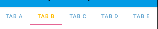
Używam nowego TabLayout z biblioteki Android Design. Udało mi się ustawić statystykę textcolor za pomocątabLayout.setTabTextColors(colorstatelist)
Jak mogę osiągnąć to samo za pomocą styles.xml?
Używam nowego TabLayout z biblioteki Android Design. Udało mi się ustawić statystykę textcolor za pomocątabLayout.setTabTextColors(colorstatelist)
Jak mogę osiągnąć to samo za pomocą styles.xml?
Odpowiedzi:
<android.support.design.widget.TabLayout
        android:layout_width="match_parent"
        android:layout_height="wrap_content"
        app:tabMode="fixed"
        app:tabGravity="fill"
        app:tabTextColor="@color/your_unselected_text_color"
        app:tabSelectedTextColor="@color/your_selected_text_color"/>
Dodatkowo istnieją atrybuty, takie jak tabIndicatorColor lub tabIndicatorHeight do dalszego stylizacji.
tabLayout.setTabTextColors(
    getResources().getColor(R.color.your_unselected_text_color),
    getResources().getColor(R.color.your_selected_text_color)
);
Ponieważ ten stary sposób jest przestarzały w API 23, alternatywą jest:
tabLayout.setTabTextColors(
    ContextCompat.getColor(context, R.color.your_unselected_text_color),
    ContextCompat.getColor(context, R.color.your_selected_text_color)
);
Oto fragment kodu zastępujący styl tekstu i wybrany kolor tekstu
<style name="MyCustomTabLayout" parent="Widget.Design.TabLayout">
    <item name="tabTextAppearance">@style/MyCustomTabText</item>
    <item name="tabSelectedTextColor">@color/tab_text_act</item>
</style>

<style name="MyCustomTabText" parent="TextAppearance.AppCompat.Button">
    <item name="android:textSize">14sp</item>
    <item name="android:textColor">@color/tab_text</item>
</style>
A oto fragment kodu układu
<android.support.design.widget.TabLayout
            android:layout_width="match_parent"
            android:layout_height="wrap_content"
            style="@style/MyCustomTabLayout" />
Wszystkie powyższe odpowiedzi są poprawne, ale myślę, że lepiej jest zastąpić domyślne style i zmienić tylko określony element, który chcesz zmienić. Poniższy przykład spowoduje pogrubienie tekstu:
<style name="Widget.TabItem" parent="TextAppearance.Design.Tab">
    <item name="android:textStyle">bold</item>
</style>
Następnie..,
app:tabTextAppearance="@style/Widget.TabItem"
Musisz tylko zmienić android:textAppearancestyl. Ponieważ TabLayout używa textAppearance. oto mały fragment kodu stylu.
<!-- Base application theme. -->
<style name="AppTheme" parent="Theme.AppCompat.Light.DarkActionBar">
    <!-- Below will reference with our custom style -->
    <item name="android:textAppearance">@style/my_tab_text</item>
</style>

<style name="my_tab_text" parent="Base.TextAppearance.AppCompat">
    <item name="android:textColor">@android:color/holo_blue_dark</item>
</style>
A jeśli nie chcesz odwoływać się do swojego Apptheme , możesz bezpośrednio określić TabLayout za pomocą poniższego fragmentu.
 <android.support.design.widget.TabLayout
            android:layout_width="match_parent"
            android:layout_height="wrap_content"
            app:tabTextAppearance="@style/my_tab_text"
            app:tabIndicatorHeight="48dp"/>
W przypadku kart niestandardowych musimy nadpisać następujące: 1) app: tabTextColor // for_unselected_text "
        <android.support.design.widget.TabLayout
            android:id="@+id/tabs"
            style="@style/MyCustomTabLayout"
            android:layout_width="match_parent"
            android:layout_height="56dp"
            android:background="?attr/colorPrimary"
            android:scrollbarSize="24sp"
            android:visibility="gone"
            app:tabTextColor="@color/white_40_percent"
            app:tabMode="scrollable" />
2) tabSelectedTextColor // dla wybranego koloru zakładki 3) tabIndicatorColor // kolor wskaźnika tabulacji
   <style name="MyCustomTabLayout" parent="Widget.Design.TabLayout">
    <item name="android:textColorPrimary">@color/white</item>
    <item name="tabSelectedTextColor">@color/white</item>
    <item name="tabTextAppearance">@style/TabTextStyle</item>
    <item name="tabIndicatorColor">?attr/colorAccent</item>
    <item name="tabIndicatorHeight">4dp</item>
    <item name="android:tabStripEnabled">true</item>
    <item name="android:padding">0dp</item>
  </style>


<style name="TabTextStyle">
    <item name="android:fontFamily">@string/font_fontFamily_medium</item>
    <item name="android:textStyle">bold</item>
    <item name="android:textAllCaps">true</item>
    <item name="android:textColor">@color/tab_text_color</item>
    <item name="android:textSize">16sp</item>
</style>
tab_text_color.xml
 <?xml version="1.0" encoding="utf-8"?>
 <selector xmlns:android="http://schemas.android.com/apk/res/android">
  <item android:color="@color/white_40_percent"android:state_selected="false"/>
  <item android:color="@color/white_100_percent"android:state_selected="true"/>
 </selector>
Dzięki TabLayoutelementom znajdującym się w Bibliotece komponentów materiałów można:
  <com.google.android.material.tabs.TabLayout
      style="@style/My_Tablayout"
      ..>
i w swoim stylu użyj tabTextColorz selektorem.
<!-- TabLayout -->
<style name="My_Tablayout" parent="Widget.MaterialComponents.TabLayout" >
    <item name="tabTextColor">@color/tab_layout_selector</item>
</style>


<selector xmlns:android="http://schemas.android.com/apk/res/android">
  <item android:color="?attr/colorPrimary" android:state_selected="true"/>
  <item android:alpha="0.60" android:color="?attr/colorOnSurface"/>
</selector>
app:tabTextColorw swoim układzie: <com.google.android.material.tabs.TabLayout
app:tabTextColor="@color/tab_layout_selector"
..>
Łatwy i doskonały sposób:
W pliku xml:
<android.support.design.widget.TabLayout
        android:layout_width="match_parent"
        android:layout_height="wrap_content"
        app:tabTextAppearance="@style/TabText"/>
W pliku stylów wartości:
uwaga: „cairo_semibold” to czcionka zewnętrzna, możesz ją zastąpić własną czcionką.
<style name="TabText" parent="TextAppearance.Design.Tab">
    <item name="android:textColor">#1f57ff</item>
    <item name="android:textSize">14sp</item>
    <item name="android:fontFamily">@font/cairo_semibold</item>
</style>
Najlepszym lub krótkim i prostym sposobem jest stworzenie niestandardowego paska aplikacji
 <?xml version="1.0" encoding="utf-8"?>
    <android.support.v7.widget.Toolbar xmlns:android="http://schemas.android.com/apk/res/android"
    android:layout_width="match_parent"
    android:layout_height="?android:attr/actionBarSize"
    xmlns:app="http://schemas.android.com/apk/res-auto"
    android:background="@color/colorAccent"
    app:theme="@style/myCustomAppBarTheme"
    app:popupTheme="@style/ThemeOverlay.AppCompat.Dark"><RelativeLayout
        android:layout_width="match_parent"
        android:layout_height="match_parent">

        <ImageButton
            android:id="@+id/btn_back"
            android:layout_width="wrap_content"
            android:layout_height="wrap_content"
            android:layout_alignParentLeft="true"
            android:background="@android:color/transparent"
            android:src="@mipmap/ic_launcher" />

        <TextView
            android:id="@+id/txt_title"
            android:layout_width="wrap_content"
            android:layout_height="wrap_content"
            android:layout_centerVertical="true"
            android:layout_marginLeft="16dp"
            android:layout_marginStart="16dp"
            android:layout_toEndOf="@+id/btn_back"
            android:layout_toRightOf="@+id/btn_back"
            android:text="Title"
            android:textColor="@android:color/white"
            android:textSize="20sp"
            android:textStyle="bold" />

    </RelativeLayout>
    </android.support.v7.widget.Toolbar>
Atrybuty XML
<com.google.android.material.tabs.TabLayout
                    android:id="@+id/tab_layout"
                    android:layout_width="match_parent"
                    android:layout_height="wrap_content"
                    app:tabIndicatorColor="@color/white"
                    app:tabBackground="@color/colorAccent"
                    app:tabSelectedTextColor="@color/white"
                    app:tabTextColor="@color/white"
                    app:tabMode="scrollable" />
W Kotlinie programowo
(tab_layout as TabLayout).setBackgroundColor(ContextCompat.getColor(mContext, R.color.colorPrimary))
(tab_layout as TabLayout).setSelectedTabIndicatorColor(ContextCompat.getColor(mContext, R.color.white))
(tab_layout as TabLayout).setTabTextColors(ContextCompat.getColor(mContext, R.color.white),
                ContextCompat.getColor(mContext, R.color.white))